Five Elements Of Design in Floristry
Artists, architects, artisans, and philosophers throughout history have produced theories to help evaluate and analyse, the qualities of their artwork.
Clothes, interiors, gardens, website, cars, technology or any product, has been designed, analysed and evaluated using a set of theories, or a set of guidelines too This ensures that the created item is fit for purpose, it does what its suppose to do, it gives value, and it's of commercial quality. It’s the same for Floristry, we have a set of rules -
The British Floristry theories are called The Elements and Principles of design.
“Come For Some Lemon Tea”
1 Colour
2 Form
3 Space
4 Line
5 Texture
These are the Elements of Design: The Floral theories are a plan or organised strategy, to ensure an aesthetically pleasing floral design and it's a way to analyse the composition too.
The Principles and Elements of Design are currently taught in floristry and used by florists and designers; the guidelines are for creating a high standard, commercial floral design. Each Element influences the other, how they work together creates the aesthetic design. Here are the five elements -
1 Colour - I feel this is the most crucial element, in the process of making a design. It's often the first thing that attracts you to something. It has a way of capturing your imagination; it creates strong feelings and emotions. Understanding how best to use and choose colours within an arrangement is very important; the combinations can add drama, excitement, passion and reflect a theme. The Colour theory is a whole subject of its own. (Learn more about the Theory of Colour in a blog post coming soon).
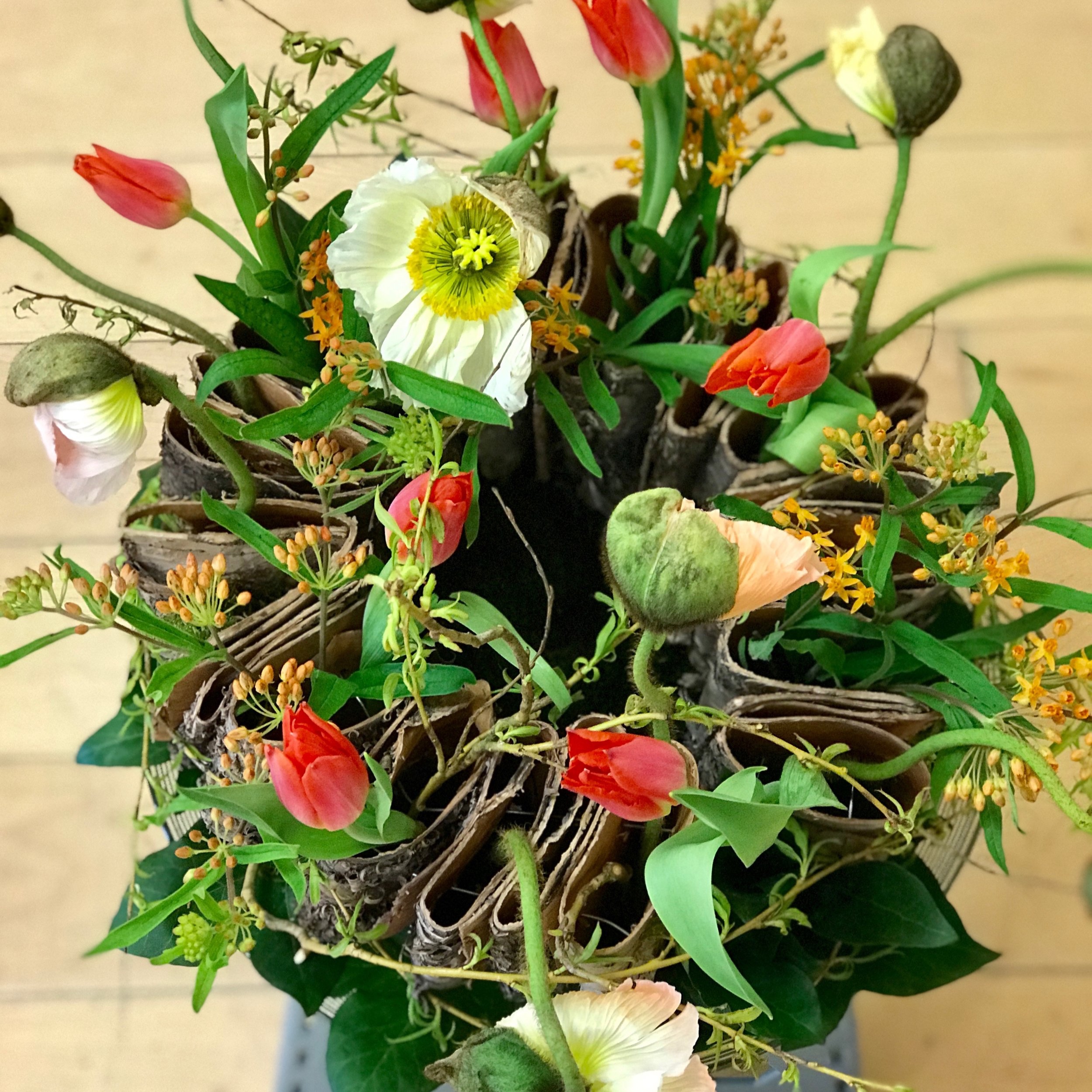
Colour combinations can add drama, emotion and reflect a theme.
2 Form - A floral design needs to have a range of different forms that work together to compliment each other; it creates a harmonious, pleasing design. The flower forms are 3-dimensional; they have - width, height, and depth, its placed within a space which is 2-dimensional. The flower forms are either a - points, rounds, lines, or transitional To understand these further have a look at the previous blog post The Four F’s.
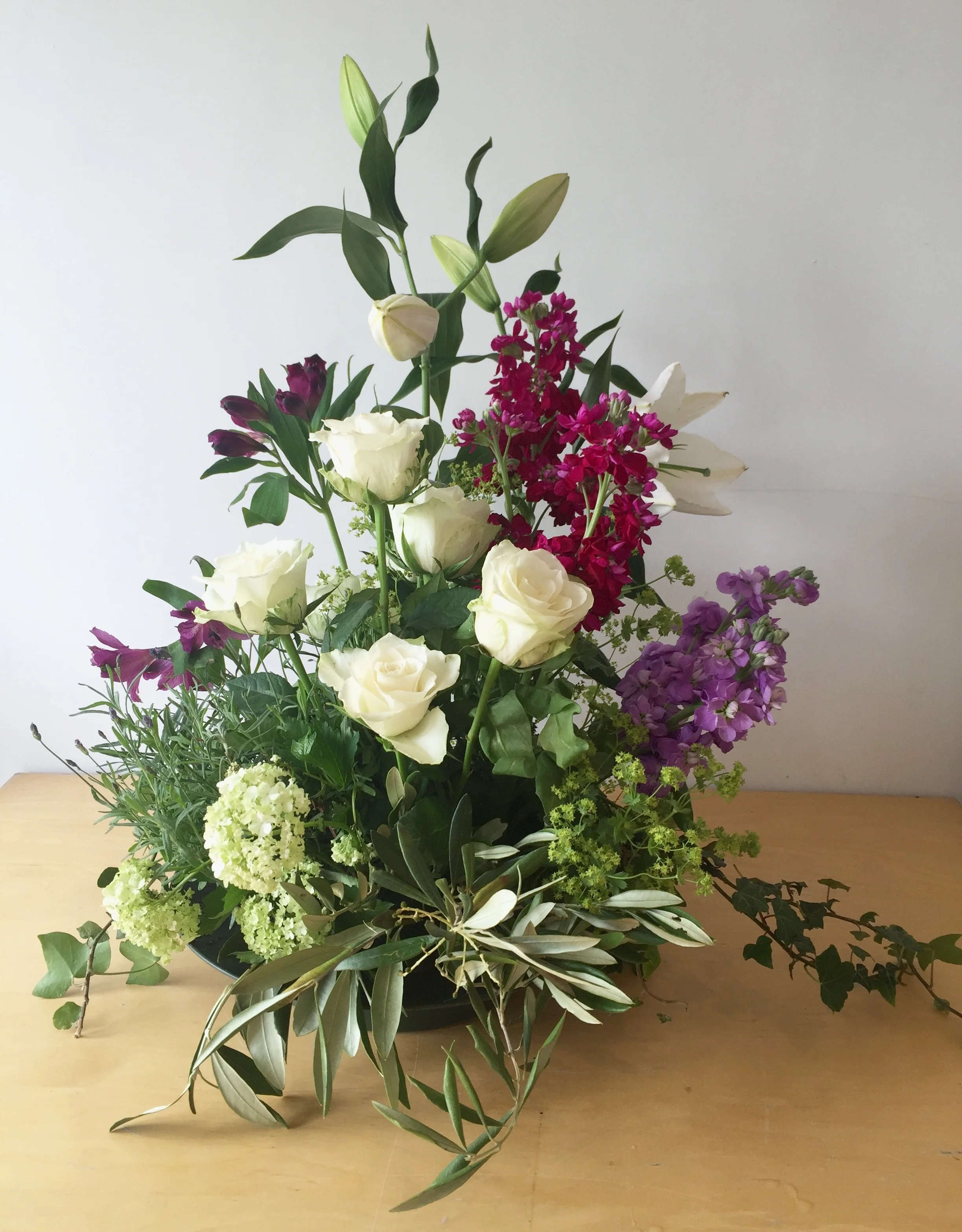
Using a selection of forms with the designs and the designs them selves are different forms too.
3 Space – A Design is made up of Space and Solids. The solid areas are 'Positive spaces'; this would be occupied by an object or flower, to draw your eye to the imaginary lines and outline of the overall design. The spaces are called Negative space, its deliberately empty, to allow the eye to rest a moment, before continuing to look at the materials within the design.
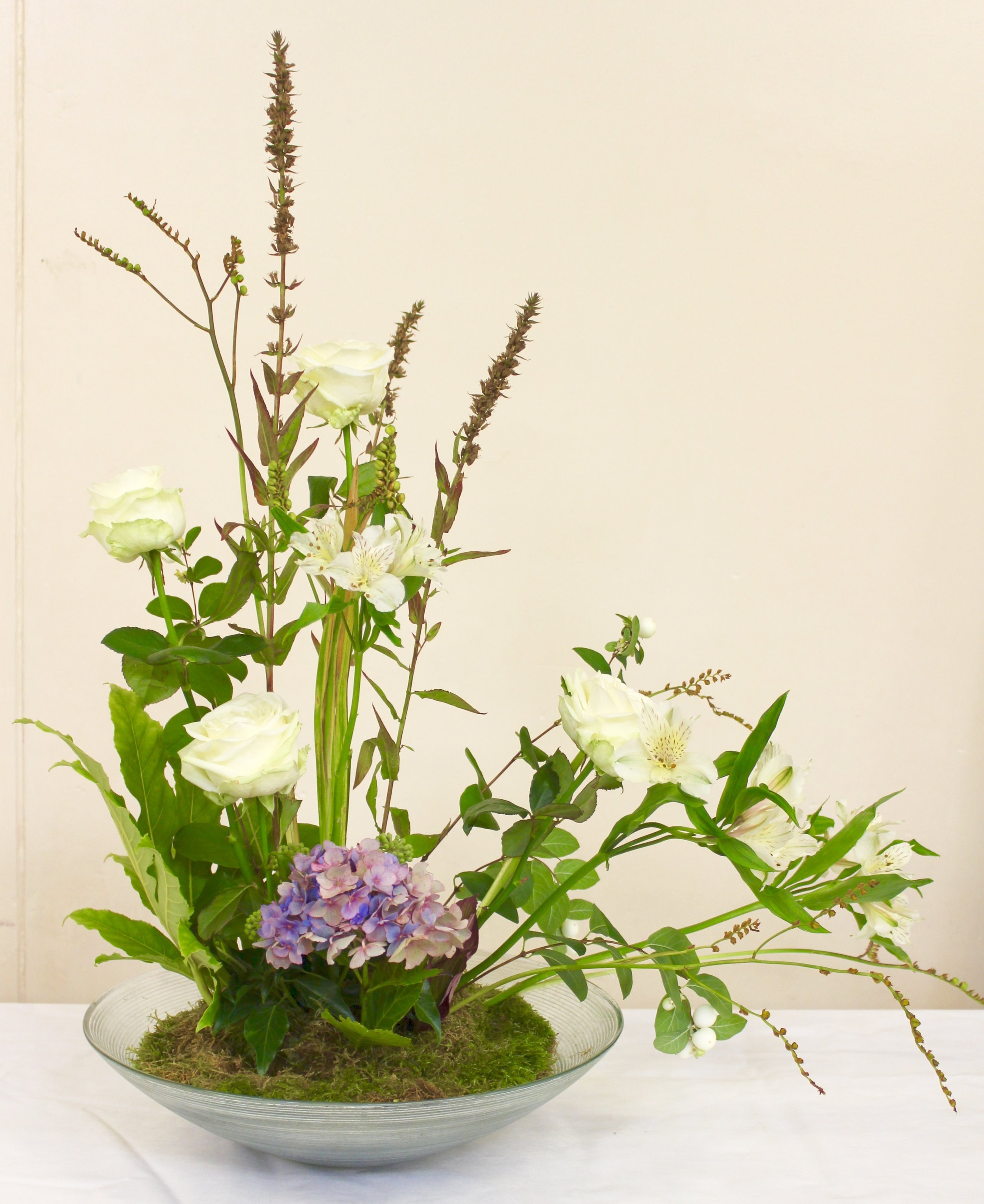
Space is so important with a design to show off the materials within it.
4 Line - This is the first element used to create the outline of the design and determines the proportion.The 'line' links the spaces between two points and creates a visual path. It guides the eye around and through the design, creating movement within it.
Lines are not always straight, they can be curved or zig zags, vertical or horizontal.
5 Texture – This is the look and feel of any material used within a design.
Actual texture, the touch and feel of the surface of any material – velvet like bun moss, smooth like Prunus (laurel leaf) or hairy like Stachys (lambs ears) leaves. Visual texture, the appearance of the flower, foliage, container or material. Using textured materials creates interest and contrast in the design.
Different textures used within the designs
The Elements are the ingredients used in the floral design; the building blocks of the design.
To fully understand and to put the knowledge into practice, have a look at the individual Element post. Once you have understood these Elements and how they interact with one another, the next step is to learn The Principles of Design. The Principles are the guidelines, achieved by using the elements of design, combine these two, resulting in a successful composition.
“Learn the rules like a pro, so you can break them like an artist.”
(Learning about the Principles of Design in the blog post coming soon)


